

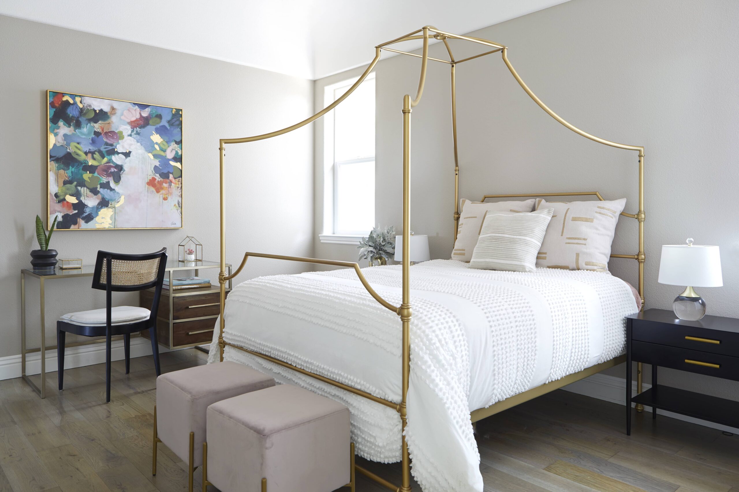
Bedroom color ideas do not have to stop at beige, white or pale gray. A restful room can carry green, blue, terracotta, pink or a deeper shade when its value, lighting and surrounding materials are considered together. The right palette depends on the room and the person sleeping in it.
Most bedroom color ideas begin with a familiar promise: choose a calming shade and the room will feel restful. That is useful up to a point. The difficulty is that color does not work separately from light, furniture, flooring, bedding or personal preference.
A neutral bedroom can feel warm and settled. It can also feel flat. A dark green bedroom can feel enclosed and comfortable in one home, then heavy in another. Color needs to be judged in the actual room.
The homeowner does not need to arrive with a paint name or a finished palette. A better starting point is the atmosphere the bedroom should have at the end of the day.
No. There is little direct research showing that one wall color produces better sleep than another. The Sleep Foundation’s review of the subject makes the same distinction: color can affect mood and emotional response, but research directly connecting bedroom wall color with sleep is limited.
That makes beige a design choice, not a sleep prescription.
Neutral rooms work well when their warmth, texture and contrast suit the space. Linen, timber, wool, plaster and upholstery can give an off-white bedroom considerable depth. A room painted beige simply because color feels risky has a different problem. It may be quiet without feeling personal.
Color can create that personality without turning a bedroom into an energetic room.
The useful distinction is intensity. Dusty rose behaves differently from clear hot pink. Muted olive has a different presence from bright grass green. A smoky blue and an electric blue belong to the same hue family but create different visual conditions.
Start with the desired feeling, then look at the conditions already in the room.
A bedroom used mainly for sleeping can tolerate a different palette from one that also contains a desk, television or reading area. Natural light matters. So do the floor, bed, large window treatments and any furniture that will remain.
| What to examine | Why it affects the palette |
| Daylight | Changes the apparent warmth, brightness and intensity of color |
| Evening lighting | Determines how the room looks during the hours it is most likely to be used |
| Flooring | Introduces a large warm, cool or neutral surface |
| Bed and headboard | Often form the largest upholstered or timber element |
| Bedding | Provides an easy place for color to change over time |
| Window treatments | Cover a large vertical area and alter both light and color |
| Artwork or wallpaper | Can provide the starting point for the rest of the palette |
Kanika Design’s current whole-home color guidance follows the same broader principle: light, fixed materials, furnishings and adjoining rooms all affect how a color reads once it leaves the paint card.
For a bedroom, evening conditions deserve particular attention. If the room is rarely occupied in bright daylight, selecting a color only from a sunny afternoon sample misses much of how it will actually be experienced.
The evidence is more nuanced than the usual lists of calming and stimulating colors suggest.
A 2023 Royal Society Open Science study placed participants in virtual red and blue rooms while varying lightness and saturation. Physiological arousal changed with both hue and lightness. Darker conditions produced higher arousal on some measures, and red produced higher skin conductance than blue under some combinations. Hue alone did not explain the responses.
An earlier study of 443 students living long term in differently colored residence buildings also found differences in color preference and mood associations. Blue was the most preferred interior color in that setting and was associated with calm, but researchers also found that people developed preferences for the color of the building in which they lived.
These studies do not produce a bedroom paint chart. They do show why broad rules such as “blue is calming” or “dark color is bad for sleep” are too simple for design decisions.
A deep color can work in a bedroom when its intensity, lighting and surrounding surfaces produce the atmosphere the homeowner wants. Strong color needs testing because a large wall area makes the choice more present.
Color does not need to cover every surface to establish the bedroom palette.
A painted wall can carry it. So can wallpaper behind the bed, an upholstered headboard, full-length curtains or a large rug. The room can then repeat smaller amounts of the color through bedding, art or accessories.
This gives the palette a hierarchy.
For example, a plum headboard against warm off-white walls creates a different room from four plum walls. Neither approach is inherently stronger. The decision depends on how much visual weight the room can carry and how enveloping the homeowner wants it to feel.
Materials soften color as well. Green velvet, green paint and green linen do not read the same way because each surface responds to light differently. Timber beside the green adds warmth. A cream wool rug changes the amount of contrast near the floor.
One strong color can therefore sit inside a quiet bedroom when the rest of the material palette gives it room.
There is no universal winner. The strongest choices are the colors that support the intended mood, work with the room’s light and sit comfortably beside the fixed materials.
Certain families offer useful starting points.
Muted greens can work well with timber, linen and other natural materials. Blues range from pale and airy to deep and enclosing. Warm earth colors such as clay, ochre or softened terracotta can create a bedroom that feels warmer without relying on beige.
Pink also has a wider range than the nursery associations it sometimes carries. Dusty rose, plaster pink and brown-leaning pinks can behave much like warm neutrals.
Darker shades such as navy, aubergine, charcoal or deep green suit rooms where an enveloping atmosphere is wanted. They need to be judged against available daylight and the lighting used after sunset.
For homeowners searching for primary bedroom color ideas (master bedroom color ideas), the same criteria apply. The phrase describes who uses the room; it does not require a separate color formula.
No. Paint is only one part of a bedroom palette.
Some of the more useful bedroom paint ideas start with everything around the paint. If there is a patterned rug, wallpaper or upholstered bed that the homeowner already loves, the wall color can be selected from it.
The reverse works too. A distinctive wall color can become the dominant field, while the bed, curtains and rug move into quieter shades.
This is especially useful for homeowners who like color but do not want several competing hues. One color family can appear at different values across paint, textiles and smaller objects.
A monochromatic bedroom does not have to be neutral. A room can move from pale green walls to a deeper green headboard and olive textiles while still reading as one controlled scheme.
Limited daylight does not automatically mean the walls need to be white.
A pale color reflects more available light, which can be useful when brightness is the goal. A darker color accepts the lower-light condition and creates a more enclosed effect. Both approaches can work.
The decision should follow the intended atmosphere.
A bedroom with little daylight that is meant to feel light and fresh will usually need a higher-value wall color and enough artificial light to support it. A bedroom intended to feel intimate can use a deeper value without pretending the room has light it does not receive.
White needs testing as carefully as any strong hue. Recent building-science research has shown that room surface color can change the spectral qualities of reflected artificial light, including measures associated with circadian response. The wall and the lamp are part of the same nighttime environment.
For practical design, that means samples should be viewed with the bedroom lamps switched on, not only against daylight.
The lighting plan should support the mood the palette is meant to create.
Bright overhead light can flatten the distinctions between paint, textiles and timber. Lower sources reveal texture differently. Bedside lamps and wall lights also place illumination closer to the materials a person sees while settling into bed.
Research into bedroom lighting has found that warmer, lower-correlated-color-temperature light before sleep can support greater subjective relaxation than cooler light under tested conditions. One chamber study comparing 2700K, 4100K and 5500K bedroom lighting also reported differences in several sleep measures.
That does not mean every bedroom needs the same bulb. It does mean paint should be reviewed under the lighting that will actually be used.
A deep blue wall under a warm bedside lamp will look different from the same wall under a cool ceiling fixture. The paint name stays the same. The room does not.
“I like to design bedrooms by starting with how the room should feel. I often select the color palette, wallpaper, and textures first, using warm, natural tones that create a calming effect at the end of the day. I avoid recessed lighting and prefer layered lighting on dimmers to keep the atmosphere soft. A bedroom should be a true retreat, not a workspace or workout area. The moment you enter, your mind should know it is time to put everything down and relax.”
Kanika Bakshi Khurana
The bedroom does not need to carry all of them at equal strength.
Start with one color that has a reason to be there. It might come from artwork, a textile, wallpaper or a piece the homeowner wants to keep. Secondary colors can then be chosen in relation to it.
A palette becomes harder to control when several saturated colors occupy similar visual areas. Variation is easier when one color leads and the others appear in smaller amounts or quieter versions.
Kanika Design’s Classy Teenage Bedroom provides a useful example from the studio’s portfolio. The room used gold, black and pink together, showing that a bedroom palette can carry more than one assertive color when the combination belongs to the person using the room.
The useful lesson is not to reproduce those three colors elsewhere. It is that a bedroom has room for identity.
Sometimes the existing room is sound and the paint is the problem.
If the furniture fits, lighting works and the main materials already relate well, changing the wall color may be enough. Bedding and window treatments can then bring the new shade into the room without wider work.
Another common case is an unfinished neutral room. The paint may be fine, while the room lacks texture, a strong headboard, adequate curtains, lamps or artwork. Changing beige to green would alter the color and leave the underlying thinness in place.
A smaller intervention is preferable when it solves the actual issue.
The bedroom needs broader design work when the palette is tied to new furnishings, wallpaper, custom millwork, lighting, window treatments or flooring. Those decisions affect one another and are easier to resolve together.
Also Read – How to Choose an Interior Color Scheme for Your Home
The studio starts with how the bedroom should function and feel. Existing elements that will remain are considered before the material and color palette is settled.
Color is then reviewed alongside furnishings, lighting and finishes. Kanika Design’s wider process uses realistic 3D presentations and physical samples so clients can see relationships between materials before major purchases or construction decisions are made. The firm’s current San Jose service page describes full-service work that includes material selections, furnishings, lighting, custom millwork and final styling.
For homeowners considering interior design San Jose, that level of service makes sense when bedroom color is part of a larger furnishing or remodeling project.
A room that needs only two paint samples compared against existing bedding does not need the same process.
Muted greens, blues, warm earth tones, soft pinks and neutrals can all work well in bedrooms. Deeper colors such as navy, plum or charcoal are also viable where a more enclosed atmosphere suits the room.
The decision should account for light, fixed materials and personal preference. Research does not support one universal bedroom color that works for everyone.
No general rule makes a dark bedroom unsuitable.
Dark paint reduces apparent brightness and gives the walls more visual weight. That can feel comfortable in one room and oppressive in another, depending on room size, daylight, artificial light and the other materials present.
Yes. Beige remains useful when its undertone works with the flooring, furniture and textiles.
A neutral room needs enough material variation to avoid feeling flat. Timber, linen, wool, wallpaper and contrasting values can create depth without adding a strong hue.
Blue and green frequently appear in research on color preference and calm associations, but the evidence does not establish them as guaranteed sleep colors.
Personal preference, lightness, saturation and lighting all change the response. The calmer choice is the one that works in the complete room and feels comfortable to the person using it.
It can be. Continuing a color onto the ceiling creates a more enveloping room and reduces the visual break between wall and ceiling.
A lighter ceiling retains more contrast and can increase the sense of brightness. The choice depends on the room’s proportions, daylight and desired atmosphere.
There is no required number.
A bedroom is easier to read when one color or color family leads and the others support it. The palette can contain several shades through paint, wood, textiles and art without treating each as an equal accent.
RECENT COMMENTS