

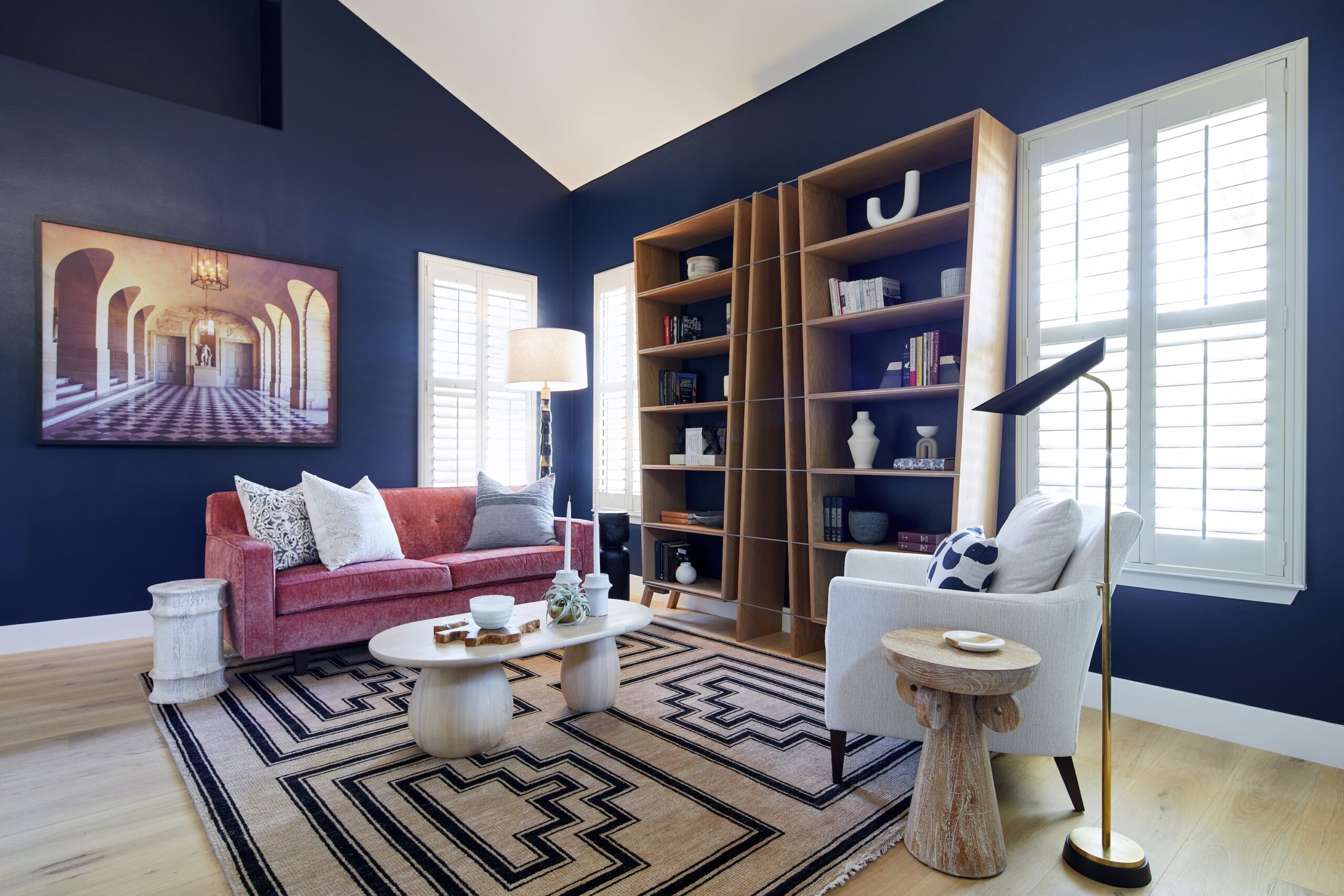
Interior color schemes work best when they begin with the room, not the paint card. Light, flooring, stone, wood, upholstery and adjoining spaces all affect how a color is experienced once it is actually in the home.
But the practical side is only part of the decision. Color also shapes how a room feels. A bedroom may need to feel restful, while a living room can carry more warmth and energy because it is where people gather. The goal is not to follow a formula. It is to create a palette that supports the room, feels personal to the people living there and connects naturally to the rest of the home.
At Kanika Design, we consider color alongside materials, lighting and furnishings rather than choosing each element separately. That makes it easier to see how the palette will behave before the room is finished.
Table of Content |
Before choosing a paint color, think about what happens in the room and how you want to feel when you are there.
A bedroom usually calls for a calmer atmosphere. Softer skin tones, muted greens, deep blues or other quieter colors may support that feeling, depending on the light and materials already in the room.
A living room has a different role. It may need to feel warm, welcoming and expressive enough for conversation and entertaining. A kitchen often benefits from a sense of freshness and clarity.
These are not rigid rules. The same color can feel very different from one home to another. The useful starting point is the mood and function of the room, then the palette can be developed around that goal.
Some elements in a room are easier to change than others.
Flooring, stone, tile, cabinetry, large upholstery and significant wood finishes often carry strong color and undertones. If those materials are staying, they should influence the palette before wall paint is finalized.
This is especially important during a furnishing or remodeling project. A natural stone slab may contain several subtle colors. A rug can introduce warmth, pattern and contrast. A sofa may occupy more visual space than the walls around it.
Paint gives you many more options, so it often makes sense to choose it after the more difficult-to-change materials are understood.
A useful question is not simply, “Which paint color do I like?” but, “Which color makes everything else in the room feel more connected?”
Lighting changes everything.
The same paint can look noticeably different from morning to afternoon and from natural daylight to warm artificial light. Orientation, window size, surrounding greenery and nearby materials can all affect what you see.
A color that feels soft in one room may become stronger in another. A neutral that looks balanced during the day may turn unexpectedly yellow or gray after sunset.
That is why color should always be tested in the actual room.
Look at samples at different times of day and under the lighting you will actually use. A living room that is mainly occupied in the evening should work beautifully after sunset, not only at noon.
The goal is not to find a color that looks identical all day. Color naturally shifts with light. The question is whether you still like the way it changes.
Undertones matter because colors are rarely as simple as their names suggest.
Two whites may appear nearly identical on a paint card, but one can lean warmer and another cooler. Gray may carry blue, green or violet. Beige may shift toward yellow, pink or green.
These differences are easier to see through comparison.
Place several similar samples next to the flooring, stone, cabinetry or upholstery they need to accompany. The relationships become clearer than when each color is viewed alone.
You do not need to identify every undertone perfectly. The goal is simply to notice when one material makes another suddenly feel too cool, too warm or disconnected.
A room does not always need to begin with a paint color.
Sometimes the best starting point is a rug, artwork, stone, fabric or another material that already has personality.
One inspiration piece can give the palette direction. A painting may introduce a warm rust or muted green that can reappear subtly in upholstery, accessories or cabinetry. A rug may contain several colors that help connect adjoining furniture and finishes.
The objective is not to match every color exactly. It is to create a relationship between the elements so the room feels layered rather than assembled.
This approach can also make color feel less intimidating. Instead of choosing from thousands of isolated paint chips, you are responding to something you already know you love.
Color is not automatically the risk in a room.
Used intentionally, it brings warmth, character and energy. A memorable room often has some emotional presence, whether that comes from a deep wall color, expressive artwork, a richly colored rug or upholstery with personality.
The mistake is not using a bold color. The mistake is using one without considering the rest of the room.
A stronger color works best when it connects to the materials, light and overall direction of the home. A neutral can be equally considered when it creates space for artwork, furnishings or texture to take the lead.
There is no need to choose between “bold” and “timeless.” Color can last when it feels meaningful to the people living with it rather than simply following a trend.
A room usually feels calmer when every color is not competing for the same amount of attention.
You may have one dominant family that creates the overall field, a supporting group of materials or colors, and smaller accents that bring contrast or energy.
That hierarchy may come from walls, flooring, upholstery, curtains, artwork and objects rather than from three literal paint colors.
This is the useful idea behind rules such as 60-30-10, but there is no need to follow exact percentages. The important thing is to decide which elements should lead and which should support them.
A room with several strong colors can still feel balanced when one clearly has more visual weight than the others.
Color does not live only on painted walls.
Wood, stone, fabric, leather, metal, rugs and tile all carry color and respond differently to light. A matte wall and a velvet chair in similar tones may feel completely different because of texture and reflection.
This is one reason a restrained palette does not need to feel flat.
A warm neutral room may include off-white walls, natural wood, caramel leather, woven fabric and a rug with several related tones. The colors are close, but the materials create variation.
A stronger palette can work the same way. Rather than adding more paint colors, depth may come from changing the texture, sheen or material.
A home does not need every room to use the same colors.
What helps is a thread that connects them.
That connection may come from warmth, saturation, undertone, repeated materials or a recurring accent. One room may be quieter while another carries more color, but the transition should feel intentional rather than random.
This is especially important in open-plan homes or rooms connected by wide openings, where several spaces are visible at once.
Bedrooms and more enclosed rooms can move farther from the main palette because they are experienced separately. Even then, a repeated wood finish, metal, textile or color family can create continuity.
The goal is flow, not matching.
Samples should be treated as part of the design process, not as a final formality.
Use larger paint samples and view them next to the materials that will remain. Look at them in daylight, evening light and under the actual lamps or fixtures planned for the room.
At Kanika Design, physical samples are considered together so wood, fabric, rugs, stone and paint can be evaluated as one palette.
This is especially valuable because screens and photographs cannot reproduce texture, sheen and changing light accurately.
If two options both work, the final choice often becomes much easier once they are seen together in the real environment.
Sometimes the room is already well resolved and the wall color is simply out of step with everything else.
In that case, repainting may be enough.
In another room, the problem may actually be artificial lighting. If a color feels good during the day but turns unpleasant in the evening, changing the lighting may improve the room more than changing the paint.
Large furnishings can create the same issue. A cool sofa, warm flooring and yellow-leaning paint may create tension that cannot be solved by looking at the wall color in isolation.
Start with the smallest change that addresses the real problem.
Read Also – Bedroom Color Ideas Beyond Beige
Color needs broader planning when several major elements are being selected together.
In a full-service furnishing or remodeling project, flooring, cabinetry, stone, upholstery, rugs, window treatments, lighting and paint all influence one another. Resolving those choices as one design creates a more cohesive result than selecting them independently.
Kanika Design approaches color as part of that larger design process. Space planning, furnishings, materials, realistic 3D presentations and physical samples are developed together so the finished palette supports both the architecture and the way the home is lived in.
The result is not a house where every room looks the same. It is a home where the rooms feel connected, personal and considered.
Color is not the risk. It brings life and warmth to a room, and people often remember how a space made them feel more than the exact shade on the wall.
I think about mood, function and flow together. A bedroom may call for something quieter, while a living room can carry more warmth and personality. Across the home, I look for a common thread in tone, warmth or saturation so each room can have its own character without feeling disconnected.
For me, color lasts when it feels personal rather than trendy. Whether the palette is bold or neutral, I always test it in the actual room because lighting changes everything.
Kanika Bakshi Khurana
A successful interior color scheme is not simply a collection of colors that look good together.
It should support the way each room is used, respond to the light, connect with the materials and create a sense of flow through the home. Most importantly, it should feel personal.
When color is chosen in context rather than in isolation, it becomes less about finding the “perfect” shade and more about creating a home that feels cohesive, expressive and right for the people living there.
Begin with how you want the room to feel, then look at the fixed materials, natural light and large furnishings already present. Build the palette around those conditions rather than selecting paint colors separately.
Use larger samples and view them in the room where the paint will be used. Check them beside flooring, cabinetry and furnishings at different times of day and under the artificial lighting you will use in the evening.
An undertone is the secondary color bias within a paint or material. A white may lean warm or cool, while a gray may carry green, blue or violet. Comparing similar colors beside the room’s fixed finishes makes these differences easier to see.
No. Rooms can have different personalities while still feeling connected. Repeated undertones, materials, wood finishes or accent colors can create flow without making every space match.
Yes. A darker palette can feel rich, intimate and intentional when it works with the room’s light and materials. Light colors can reflect more light, but they are not automatically the best choice for every small or dim room.
RECENT COMMENTS