

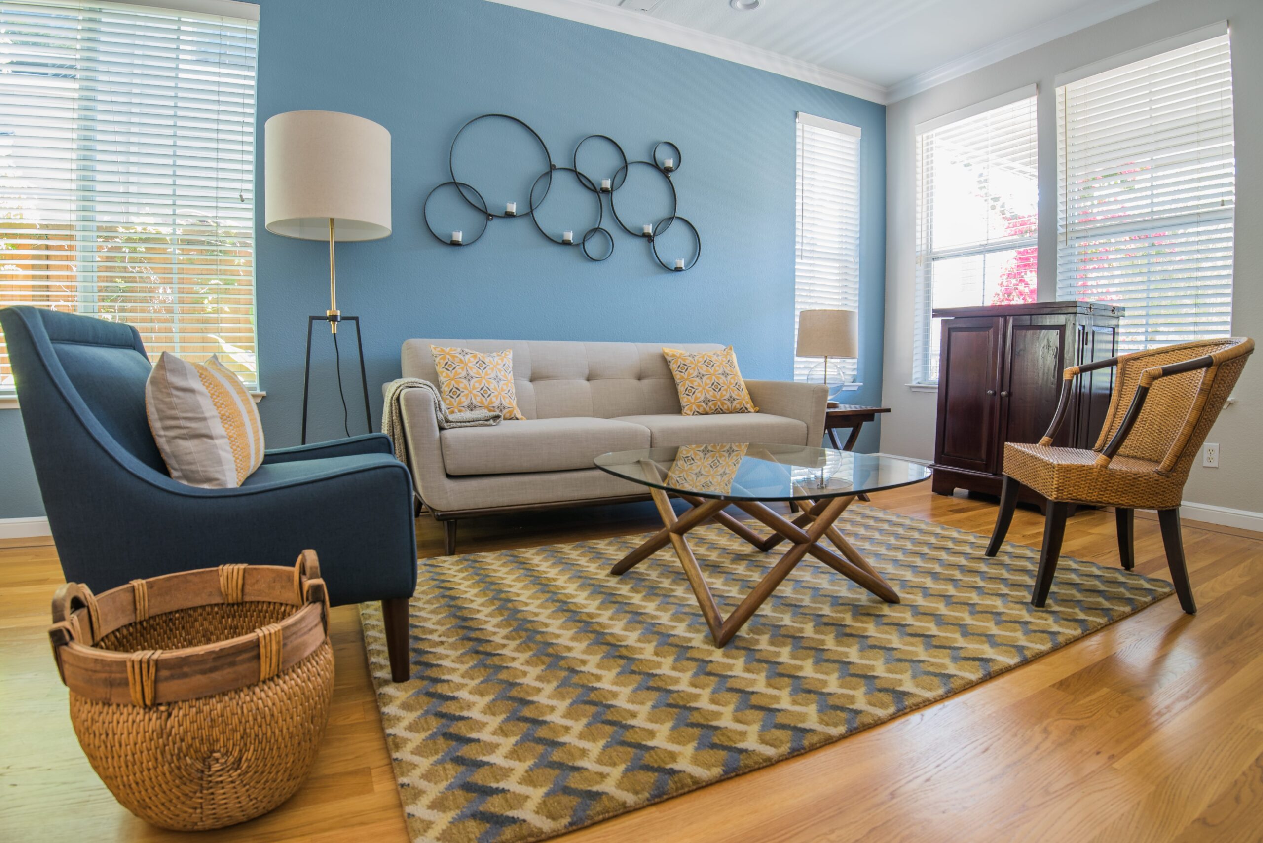
Coastal interior design works best when the setting leads the room. Natural light, outdoor views, tactile materials and an easy relationship between inside and outside can create a coastal character without relying on nautical motifs. Color and decoration should respond to the particular home rather than follow a standard beach-house formula.
Coastal interior design is often reduced to white walls, blue accents, pale wood and a few obvious references to the sea. Those choices can work, but they describe one version of the style rather than the principle behind it.
A coastal home already has information coming through the windows. The light, sky, vegetation, water and weather can do more to establish the atmosphere than another decorative object.
You do not need to arrive with every answer. Start with what the home already receives from its setting.
The strongest coastal rooms tend to have an easy relationship with their surroundings.
Views matter. Daylight matters. So does the way furniture is positioned around windows and doors. A recent study of actual window views found that participants reported substantially greater satisfaction with views containing richer natural content. A wider review of daylight and window-view research also found consistent interest in how access to outside views affects occupants’ perception and well-being, while cautioning that responses vary by setting and study method.
For design, this means the view should be treated as part of the room.
A sofa placed directly across a valuable sightline, heavy window treatments left closed throughout the day or furniture that blocks access to a terrace can weaken a home’s connection to its setting before color or decor enter the discussion.
“Water has a natural calming effect, and a coastal home should capture that same sense of ease. I like to begin with a warm, neutral palette and introduce shades of teal and turquoise as thoughtful accents to bring the space to life. Natural textures and organic details, such as woven materials, weathered wood, or shells, add character while keeping the connection to the coast subtle and sophisticated.”
Kanika Bakshi Khurana
No single palette defines the coastal design style.
A room overlooking gray-blue water and eucalyptus may suggest cooler colors. A sunnier property with warm stone and dry planting might sit more comfortably with sand, clay, cream and muted green.
Blue can still belong. It simply does not have to carry the entire idea.
The existing materials should come first. Flooring, stone, cabinetry, exposed timber and large upholstered pieces establish much of the room’s color before paint and accessories are selected.
| What the home already gives you | Possible color direction |
| Water or broad sky views | Muted blues, blue-grays or quieter neutrals |
| Warm timber floors | Cream, sand, clay or softened greens |
| Cool stone | Warmer textiles and wood can balance it |
| Strong garden views | Pull from foliage rather than adding an unrelated coastal blue |
| Limited daylight | Test pale colors carefully so they do not become dull or cold |
| Bright open rooms | Deeper color can provide contrast without making the room heavy |
The palette should make sense with the view even when the curtains are open.
Texture usually carries coastal character more quietly than imagery.
Linen, wool, timber, woven fibers, stone and plaster-like surfaces all respond visibly to light. They also allow a restrained palette to retain depth.
A smooth white wall beside white lacquered furniture produces a different effect from warm plaster beside oak, linen and a wool rug. The colors may be similar while the room feels completely different.
This is where relaxed coastal interiors usually succeed. They have enough variation in surface and material to keep the room interesting without filling it with decorative signals.
Hard materials need some softness around them. Stone flooring can work with an upholstered chair, textured rug or full-height curtain. Large glass areas can benefit from fabrics that make the room feel comfortable after daylight fades.
Usually less than the search results suggest.
Coastal home decor becomes useful when an object has a genuine connection to the home, the owner or the setting. A shell collected on a meaningful trip has context. A framed nautical symbol bought only to make the room look coastal has a much harder job.
Artwork offers more freedom. A room near the water does not require paintings of boats. Abstract work, photography or pieces collected over time can live comfortably in the same interior.
Decor should finish the room after the major relationships are working: furniture scale, light, materials and circulation.
A few objects with space around them often say more than a shelf filled with coastal references.
The problem usually appears through accumulation.
A striped rug may work. So may rattan, weathered timber, blue upholstery or a shell object. When every decision is trying to signal “coast,” the room begins to feel themed.
This happens with materials too. Pale washed wood across every furniture piece can flatten the room in the same way that overmatching any finish can.
Variation helps. Clean-lined furniture can sit beside a woven piece. Dark timber can give a pale room needed weight. A strong artwork may be a better choice than another blue accessory.
The coast should remain the context, not a decorating assignment.
Modern coastal interior design tends to reduce the decorative vocabulary and keep the useful parts: daylight, views, natural materials and comfortable furniture.
A modern room might use oak, textured plaster and linen without any overt nautical detail. Another may carry a deep teal chair against warm neutral walls because that color belongs with the landscape outside.
Contemporary furniture can also sharpen a softer material palette. Straight lines beside woven textures prevent the room from drifting into a generic beach-cottage look.
The result can still feel easy and informal. Ease comes from how the room functions as much as from its colors.
Sometimes, although the building condition matters more than the label “coastal.”
If a home experiences persistent indoor humidity, condensation or moisture intrusion, decoration cannot solve that issue. The U.S. Environmental Protection Agency identifies moisture control as central to preventing indoor mold and recommends addressing leaks, condensation and excess humidity directly.
For interiors, that means material selection should follow the actual conditions of the home.
A rug, upholstery fabric or timber finish should not be chosen on the assumption that every property near the coast has the same moisture environment. Check what happens in the room first.
This is particularly relevant in older houses where windows, ventilation or previous water intrusion may already need attention.
Yes.
A view makes the relationship more literal, but the qualities people respond to in coastal rooms are not exclusive to waterfront property. Light, natural materials, quiet color and an uncluttered connection to outdoor space can work in many homes.
The distinction is in how far the theme goes.
A Burlingame home looking toward the Bay may draw directly from its surroundings. Another property farther from water can use some of the same materials while allowing its own architecture and garden to determine the palette.
There is no need to manufacture a view the house does not have.
Also Read – 20 Interior Design Styles Explained: A Guide to Popular Looks
Kanika Design begins with the home and the way the client lives in it. For coastal-influenced rooms, that means looking at natural light, sightlines, existing finishes and the relationship with outdoor areas before selecting the decorative layer.
The studio’s broader process includes space planning, material and finish selections, furnishings, lighting, custom millwork and final styling. Its current Burlingame service page describes the same full-service approach for local homes.
For homeowners looking for an interior designer in Burlingame, this level of work makes sense when the coastal direction affects the furniture plan, materials, lighting or several rooms together.
A room that already functions well and only needs a few accessories or a new paint color does not require the same scope.
Coastal interior design draws from the light, materials and atmosphere associated with living near water.
Typical elements include natural textures, lighter palettes and strong connections to outdoor views, but there is no required set of colors or decorative motifs.
Warm whites, sand tones, blues, greens and earth colors can all work.
The useful palette comes from the home’s daylight, fixed materials and surrounding landscape. A wooded Bay Area property may call for different colors from an open oceanfront house.
No.
Objects such as shells can work when they have meaning or suit the room, but they are not required. Art, natural materials and furniture can establish a coastal atmosphere without literal references to boats or beaches.
Coastal design is broader and can be based on light, material, color and connection to the outdoors.
Nautical decoration uses more direct maritime references such as stripes, anchors, rope or boat imagery.
Yes. Dark timber or upholstery can give weight to a pale room and create useful contrast.
The furniture still needs to work with the scale, light and other materials in the room.
Yes. Natural materials, daylight and an easy palette can work away from the water.
The room should still respond to its actual architecture and surroundings rather than trying to imitate a beachfront property.
RECENT COMMENTS