

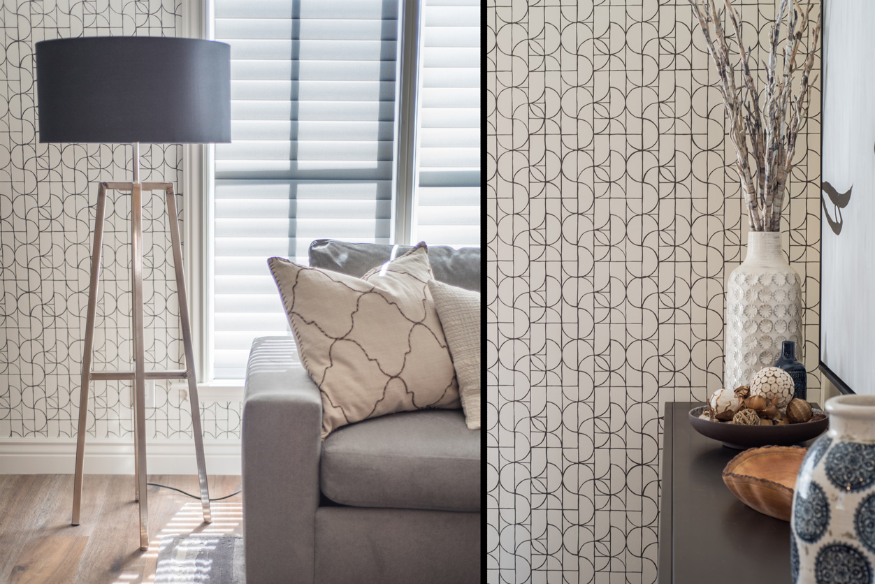
Patterns in interior design adds detail, movement and personality to a room. The difficult part is deciding how much the space can carry. Patterns work together more easily when they differ in scale, share part of their color palette and have enough quieter material around them for each motif to remain legible.
Patterns in interior design can come from wallpaper, rugs, upholstery, tile, drapery, art and even the grain of natural materials. A room can use several of these at once and still feel ordered.
The number of patterns matters less than their relationship. Two prints with similar scale and equal visual strength can compete. A large botanical beside a small geometric can be easier to read because each occupies a different visual level.
Homeowners do not need to decide in advance how many patterns a room should contain. Start with the material or object that already deserves a place, then judge what the room still needs around it.
Pattern becomes easier to coordinate when one element establishes the direction.
That might be a rug with several colors, wallpaper with a strong repeat, an upholstered chair or a textile the homeowner wants to keep. Secondary patterns can then take one or two cues from it without copying the original motif.
Three variables are especially useful:
| Variable | What to look for |
| Scale | Use patterns that are visibly different in size |
| Color | Repeat part of the palette without matching every color |
| Visual weight | Decide which pattern should be noticed first |
| Placement | Separate stronger motifs when the room needs a visual break |
| Material | Let texture add variation without introducing another printed motif |
The same test helps when mixing patterns in home decor. If every pattern is similar in size, contrast and color strength, the eye has little information about which one should lead.
No. The room needs enough connection for the patterns to belong together.
Color is one way to establish that connection. A striped cushion might pick up the green from a floral rug. A geometric wallpaper may share the warm brown already present in wood furniture.
The motif itself can change completely.
This gives the room variation while retaining a recognizable palette. Exact coordination can produce a different problem, especially when every textile looks as though it came from the same collection.
Kanika Design used a related approach in its Eclectic Living + Dining project in San Carlos. The connected rooms used a largely monochromatic palette, with wallpaper adding detail to the walls alongside custom furnishings, wood and handmade silk rugs. The restrained color base gave the additional surface treatment a place within the wider scheme.
Scale determines how quickly the eye reads a repeat.
A large botanical or geometric print may reveal only a few repetitions across a curtain or wall. A small check, stripe or dotted fabric repeats many times across the same area.
Several small, dense patterns can make a room feel busier because the eye encounters more repeated edges. Research on visual complexity supports that general relationship: images with greater edge density tend to be perceived as more complex.
For interiors, the practical lesson is simple. Changing scale often does more than changing the motif itself. A broad stripe can sit beside a small floral more comfortably than two florals with similar repeat sizes.
There is no universal number.
Research into responses to interiors suggests that people tend to prefer visual interest that still feels coherent. That is useful as a broad design principle, but it does not provide a formula for the number of patterns a room should contain.
A room can carry substantial visual information when the patterns have hierarchy. One may lead, another may support it, while quieter surfaces give the eye somewhere to rest.
Pattern becomes harder to control when several motifs have similar scale, contrast and visual strength.
Give the strongest pattern enough surface area to make sense.
Wallpaper often needs an uninterrupted wall or a clearly defined section. A patterned rug needs enough visible area around furniture for its scale to register. An upholstered chair can carry a much stronger motif because the pattern occupies a smaller part of the room.
The architecture also affects placement. A room with detailed millwork, a prominent fireplace or strong natural stone already contains visual information before a printed pattern enters it.
A repeated motif within a room interior design pattern should therefore be considered alongside those existing elements. Patterns can reinforce an architectural feature, define a furniture group or introduce contrast to an otherwise quiet surface.
Yes. Strength and quantity are separate decisions.
A bold pattern design can rely on one confident surface while the remaining materials become quieter. A graphic rug with plain upholstery is one example. Patterned wallpaper with a solid headboard is another.
This is useful for homeowners who like expressive rooms but hesitate because they associate pattern with clutter.
A strong motif usually needs some uninterrupted material around it. Solid upholstery, natural timber, plain plaster or a quieter rug can provide that breathing room without making the room sparse.
The strongest pattern does not need several competitors to make the room interesting.
Pattern needs a little more planning in connected spaces.
A wallpapered dining room seen from a living room becomes part of both views. A patterned stair runner may appear alongside an entry rug, upholstery and artwork. Each room still has its own identity, but the sightline joins them.
Color can provide continuity here. The living room does not need to repeat the dining room wallpaper; carrying one related hue into a cushion, rug or artwork may be enough.
This is one route to cohesive interior design without repeating the same fabric or motif throughout the house.
The pattern should make sense from the doorway as well as from inside the room.
A room that already feels busy may have enough pattern.
Before buying another printed cushion or rug, identify what the eye is already processing. Strong wood grain, veined stone, books, artwork, open shelving and detailed architecture all contribute visual information even though they are not conventional prints.
Removing one small patterned element sometimes creates enough separation for the stronger pieces to read more clearly.
Changing patterns is also one of the simpler interventions available in a room. A pillow, throw or small rug can be exchanged without redesigning the space. Wallpaper, tile and custom upholstery deserve more consideration because changing them involves more work and investment.
Also Read – 20 Interior Design Styles Explained: A Guide to Popular Looks
Kanika Design starts with the room and the people using it. Kanika’s public work and biography show a preference for bold color and for mixing different design influences, but those elements are developed inside a wider material and furnishing plan.
For a furnishing project, the studio can review wallpaper, rugs, upholstery, window treatments and other materials together before purchasing. Seeing the samples beside one another makes scale and color relationships easier to judge than selecting each pattern separately.
For homeowners looking for a Bay Area interior designer, pattern becomes part of a larger design service when it connects with furniture, material selection, custom work and the room’s overall layout.
A room that only needs two new pillows does not require that level of design involvement.
There is no fixed number. A room can support several patterns when their scale, color and visual weight create a clear hierarchy.
The room itself matters too. Existing architecture, artwork, stone and wood grain add visual information before printed fabrics or wallpaper are considered.
They do not need identical palettes.
Repeating one or two colors is often enough to create a relationship between different motifs. The remaining colors can vary if the room still reads coherently.
Yes. Their differences can make them easier to combine.
Scale and color usually matter more than whether one motif is floral and another geometric. A large floral and a small geometric with a shared color can create clearer separation than two similarly scaled florals.
Yes. Room size does not automatically dictate pattern size.
A large-scale wallpaper or rug may read clearly in a small room because fewer repetitions are visible. The decision depends on how much wall or floor area is available and what other visual elements occupy the space.
Start with movable items such as cushions, throws, lampshades or a rug.
These allow the amount and scale of pattern to be tested before committing to wallpaper, tile or custom upholstery.
RECENT COMMENTS