

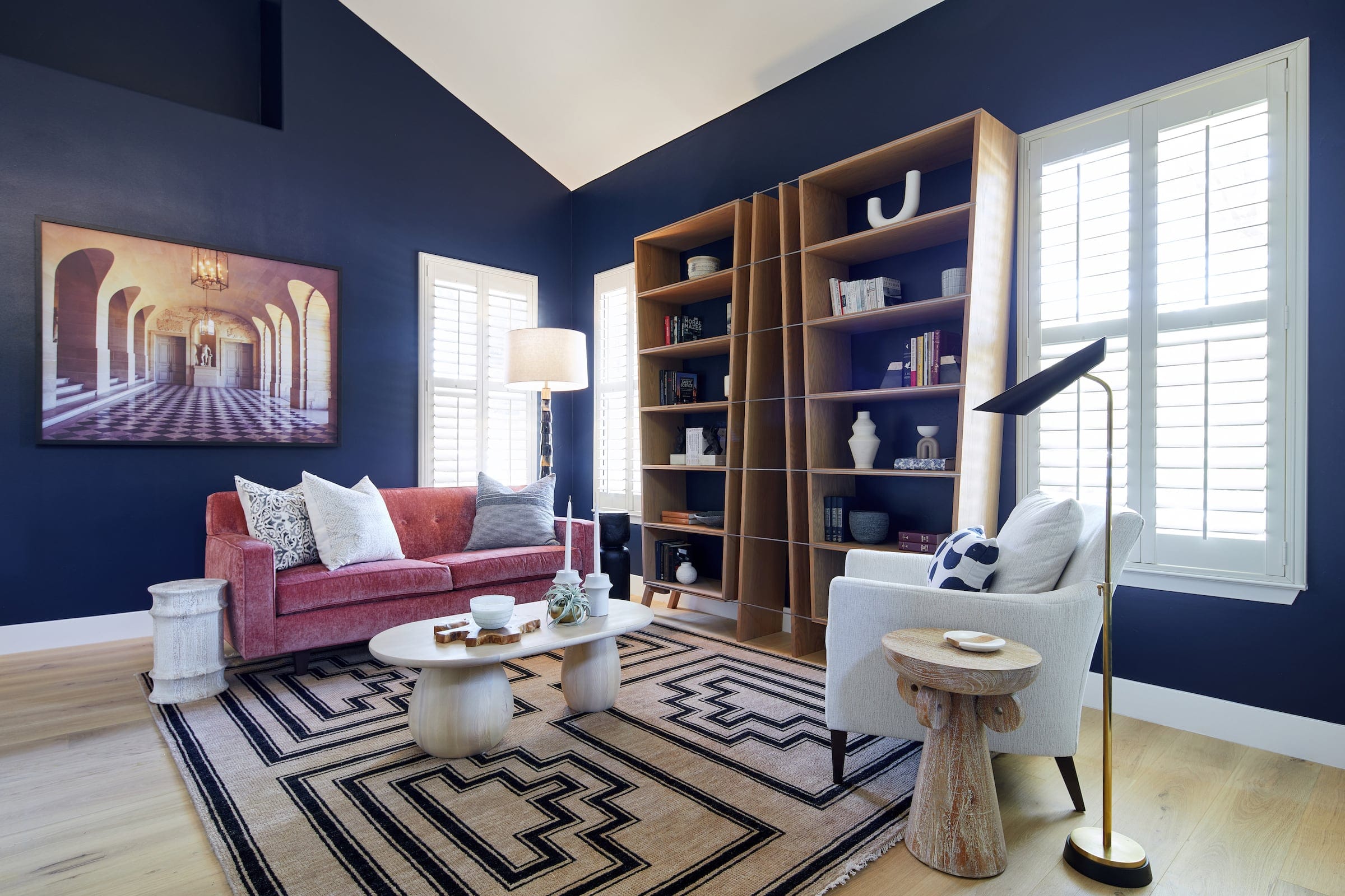
A bold home interior uses saturated color where it has a clear purpose. Light, architecture and existing materials determine how far that color should go. Deeper greens, blues, clay tones and other stronger hues work especially well when quieter finishes around them provide balance.
For years, many Bay Area homes defaulted to pale gray, white and other low-risk neutrals. That restraint still has a place, but it no longer needs to govern the whole house.
A bold home interior might take shape through one deep-blue study, rust-colored dining room or green kitchen rather than through color everywhere. Current 2026 design data shows growing interest in warmer earth tones and richer material palettes, while recent San Francisco interiors demonstrate how saturated color can sit comfortably within historic architecture.
You do not need to arrive with a complete palette. Start with the spaces where stronger color would improve the room’s character or support how it is used.
Gray became useful because it worked across many finishes and carried little stylistic risk. Used well, it still does.
The problem appears when the same cool neutral covers the walls, upholstery, flooring and cabinetry. Materials begin to flatten into one another, especially in rooms that receive cooler daylight.
Houzz’s 2026 trend research found rising searches around rust, chocolate brown, sage, cream and other warm colors, alongside interest in terracotta, limewash and natural materials. Its fall report describes warmth and layered materials as part of a broader shift in current home design.
That gives homeowners more choices. Gray can stay where it belongs; it simply no longer has to be the automatic answer.
Color needs a relationship with the surfaces around it.
A deep green wall behaves differently beside white oak than beside dark walnut. Burgundy upholstery changes again when the floor is limestone, pale carpet or warm timber. Before choosing the paint, look at the materials that will remain.
Light changes the result just as strongly. A saturated color that feels rich in a sunny south-facing room may become dense in a darker space.
A useful review looks like this:
| Check first | What it tells you |
| Natural light | How dark or saturated the color can become |
| Flooring | Which undertones already dominate the room |
| Wood and stone | Whether the palette needs warmth, contrast or restraint |
| Large upholstery | How much additional color the room can carry |
| Adjoining rooms | Whether the transition will feel abrupt or connected |
| Art and rugs | Which colors already have a reason to appear |
Paint samples should be viewed on more than one wall and at different times of day. A small chip cannot reproduce the effect of a large colored surface.
Bold interior design is about commitment more than quantity.
A single color carried across walls, trim and built-ins can have greater impact than several unrelated accent colors scattered through furniture and accessories. A strongly colored sofa can lead a pale room if its scale and placement justify the attention.
The 2026 San Francisco Decorator Showcase demonstrates that range. Designers used periwinkle, blue and other expressive colours alongside Victorian architecture, antiques, contemporary furniture and culturally specific details. Color formed part of a larger composition instead of behaving like decoration added at the end.
A recent San Francisco Victorian featured by Architectural Digest makes a similar case through a bright red kitchen, floral fabrics and layered color. The historic structure remains legible because the color belongs to a complete furnishing and material scheme.
Rooms with a clear identity are good places to begin.
A study, library or dining room can support deeper color because the room already has a defined use. Cabinetry is another strong candidate because color becomes part of an architectural surface instead of another small accessory.
Bedrooms can take color too, although the choice needs to suit the person sleeping there. There is no universal “calming” blue or “energizing” yellow that works for everyone. Interior color research emphasizes personal preference, culture, geography and the interaction between color and light as part of the design process.
For an open living area, color needs more coordination because several zones are visible together. A strong sofa, rug or artwork may provide enough color without turning every wall into another focal surface.
Bay Area home decor is becoming less dependent on pale neutrality as the signal for a current home.
The change is visible in richer woods, warmer wall colors, vintage pieces and rooms that show more personal history. Current national trend data supports that move toward collected interiors, while the San Francisco Showcase provides a local example of designers using color, pattern and historic reference with considerable freedom.
Palo Alto and the wider Peninsula also contain several kinds of residential architecture. A mid-century house, traditional property and contemporary new build give color different jobs.
The architecture should still set the terms. Deep color can emphasize good millwork, define a built-in library or give a compact room more identity. A room with expressive stone, strong wood grain or patterned flooring may already have enough visual information.
A colorful home interior needs repetition, although that repetition can be subtle.
A dining room painted oxblood does not require an oxblood living room. A smaller amount of the same family might return in artwork, a rug or upholstery farther through the house.
Undertones matter too. Several colors can coexist comfortably when they share a warm or cool bias and relate to the fixed materials.
For a whole-home scheme:
The result should feel connected as you move through the house without making every room behave the same way.
Neutral surfaces are useful when they provide relief.
A room with strongly figured stone, colorful art and patterned upholstery may benefit from a quiet wall. In another room, pale upholstery can give a saturated wall more room to dominate.
This balance also protects the pieces that matter. If a client owns a large artwork with strong color, the design can begin there instead of asking the wall, rug and sofa to compete with it.
Neutral does not have to mean gray. Warm white, plaster tones, pale wood and natural stone can create quieter areas while still carrying material character.
A poorly chosen color is tiring. So is a neutral scheme that never felt personal in the first place.
Longevity depends on why the color was selected. A hue chosen because it works with the architecture, daylight and furnishings has a stronger foundation than one selected from a trend forecast alone.
Current trend reports are useful because they show homeowners what is becoming possible again. They should widen the options, then leave the final decision to the house and the people in it.
The most committed color choices are often the least dependent on novelty.
Also Read – 20 Interior Design Styles Explained: A Guide to Popular Looks
Kanika Design describes its Palo Alto work as full-service design shaped around personal style, everyday function and the character of the home. Its current service scope includes space planning, finish selection, furnishings, lighting, custom millwork and final installation, allowing color decisions to be reviewed with the other materials they affect.
That matters because paint is rarely isolated in a substantial project. Cabinet finishes affect stone. Flooring affects wall color. Upholstery, art and lighting change how a saturated room reads once it is furnished.
For homeowners looking for an interior designer in Palo Alto, full-service design makes sense when color is one part of a larger furnishing or remodeling project and several rooms need to relate to one another.
If you are ready to move beyond default neutrals and want color decisions made as part of the whole home, contact Kanika Design to discuss the project, the rooms involved and how boldly you want to use color.
Gray still works in homes where it suits the light and materials.
Current 2026 design trends show increasing interest in warm earth colors, natural wood and more layered interiors, so gray is becoming one option among a much wider set of choices.
There is no single replacement.
Current trend data shows interest in rust, chocolate brown, sage, cream and other warmer colors. The right choice for a particular home still depends on its flooring, daylight and adjoining finishes.
Yes. Size alone does not require pale walls.
A small study, powder room or dining space can support a dark saturated color when the lighting and surrounding materials work with it.
Start with one substantial element such as upholstery, cabinetry, a rug or artwork.
Larger intentional areas of color usually create a clearer result than scattering many small accessories through the room.
No. Connected rooms need relationships, not identical colors.
Repeating undertones or smaller amounts of a color can create continuity while allowing individual rooms to have their own character.
RECENT COMMENTS