
Bold living room colors are saturated, committed hues, deep greens, inky blues, terracotta and ochre, used as the defining gesture of a room rather than a nervous accent. They are a position, not a risk. A room built on one confident color reads as collected and personal in a way a careful, colorless room rarely manages. The work is in choosing the hue and anchoring it so it feels inevitable instead of loud.
Table of Content |
Bold color is only a risk when it is unanchored. Choose one element to carry the color, a sofa, a wall, one large piece, then keep the rest of the room calm, and the result reads as deliberate rather than loud. Done with intent, a saturated room is the opposite of a gamble. It is a decision.
The fear is understandable. Color feels permanent in a way a neutral never does, and a wrong green can sit in a room for years, reminding you of the afternoon you second-guessed it. But the rooms people actually remember, the ones that feel like someone lives there, rarely play it safe. They commit. What looks like risk from the paint aisle is usually just the absence of a plan, and a plan is the whole job.
Color is not a trend the studio is borrowing. It is where Kanika comes from. Long before jewel tones reached a fashion runway, saturated reds, deep blues, and emerald greens were the language of Indian design, dyes so costly that royal families in Rajasthan, Gujarat, and the Deccan reserved them for power and celebration. Saturated has meant precious for centuries, and the recent rush back from beige is less a new idea than a memory returning.
That heritage shows up in how we think about a room. Color is not decoration laid on at the end. It is structural, the first decision, the one the rest of the room answers to. A family raised around vibrancy reads a confident room as warmth, not noise.
“Color isn’t a risk. The risk is a room so careful that no one remembers being in it.”
Kanika Bakshi Khurana
A saturated room works when the color has a job and a place. Spread the same intensity evenly across every surface and the eye has nowhere to rest. Give it one anchor and a clear hierarchy, and even the boldest hue can feel calm.
A handful of moves do most of the work:
Clients come in afraid of color and leave wishing they had used more. We test the hue against the room’s actual light, anchor it to one strong element, and keep everything else quiet, so the color has the room to be itself.
Kanika Bakshi Khurana
A color is only half a decision until you know how the room’s light will treat it. The same deep blue can read as ink in one home and denim in another, and the difference is mostly the window. North-facing rooms get cool, blue-leaning light that deepens cool colors and can flatten warm ones. South-facing rooms get warm light that lifts reds, ochres, and yellows. East and west rooms swing through the day, generous at one end and dim at the other.
The practical move is patience. Paint a large swatch, set it on the wall it will actually live on, and watch it from morning coffee to evening lamplight before you commit a drop to the whole room.
| Room faces | The light | Colors that hold up |
|---|---|---|
| North | Cool, blue-leaning | Warm hues, ochre, terracotta, warm greens |
| South | Warm and bright | Cooler saturates, deep blue, emerald, aubergine |
| East or west | Shifts through the day | Test the swatch morning and evening first |
The bold living room paint colors that hold up most often are deep navy, emerald green, terracotta, ochre, and aubergine. Which one is right comes down to the room’s light. Warm hues like terracotta and ochre lift a cool, north-facing room, while cooler saturates like navy, emerald, and aubergine come alive in warm, south-facing light. The table above maps each direction to the colors that hold up, so the choice is less about taste than about which hue the room will flatter all day.
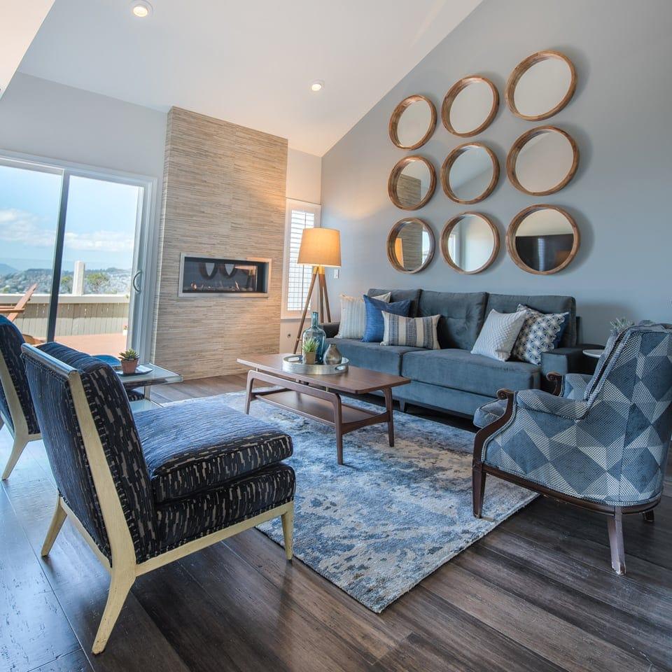
A saturated wall earns its authority because everything around it stays quiet. That isn’t a compromise, it’s how the color gets heard. In a Kanika living room the bold wall usually sits against quiet floors, a calm large sofa, and a few natural materials that cool the eye between bright moments. Velvet, oiled wood, aged brass, a wool rug in a muted ground, these give a strong color something to play against instead of more color to compete with.
The discipline is in the edit. Three or four colors, chosen to belong together, will always outperform eight chosen because each looked pretty alone. A room that tries to be bold everywhere ends up bold nowhere. Restraint is what gives the one brave choice the room to be heard.
Read Also – 20 Living Room Design Ideas for a Cozy Gathering Space
The Bay Area is a good place to be brave with color, as long as you respect the light. On the Peninsula, the Eichler legacy left a generation of homes built for indoor-outdoor living, walls of glass that pull daylight across a room from morning to night, which means a saturated wall is never one color but a dozen versions of itself over a day. That is an argument for commitment, not caution. A deep green that reads quiet over breakfast can turn jewel-like by dusk, and a room brave enough to commit gets all of it.
Bold living room colors are the most personal decision in a room, and chosen with intent they read as calm conviction rather than chaos. Kanika Design, an interior design firm based in the San Francisco Bay Area, has treated saturated color as a structural decision since the studio opened in 2008. We design from heritage and from years of travel, and we would rather a family live in a room they remember than one built to offend no one. If a careful, colorless room is what you come home to, the living room that earns its beauty is the companion to this one. If you’re ready to commit to color, start a conversation with the interior designers in the San Francisco Bay Area at our studio, and we’ll choose the hue and anchor it together.
The 60-30-10 rule splits a palette into roughly 60 percent a dominant tone, 30 percent a secondary, and 10 percent an accent. It keeps a bold scheme balanced rather than chaotic. Most rooms hold three or four colors in all, or several tones drawn from one family.
North-facing rooms get cool, blue-leaning light that can flatten cool colors, so warm hues tend to hold up best. Ochre, terracotta, and warm greens read rich rather than cold. The surest test is a large swatch on the actual wall, watched from morning to evening.
Anchor it. Let one element carry the color, a wall, a sofa, or a large work, and keep the floor and large furniture calm. Pair the saturated hue with neutrals and natural textures, and use a matte finish so the color reads rich instead of glaring.
Yes, always. The same color shifts with a room’s light through the day and looks different from home to home. Paint a large swatch, set it on the wall it will live on, and look at it in morning and evening light before you commit a drop to the whole room.
Three or four is a safe ceiling for most rooms, or several tones drawn from a single family. The point is a clear hierarchy, one dominant color, a secondary, and an accent, rather than a handful of strong colors competing for the same attention.
Colors feel luxurious when they have depth and complexity. Deep greens, navy blues, aubergine, warm terracotta, and layered neutrals create a richer effect than bright primary colors, partly because they shift with the light through the day. Saturation and undertone do more for a sense of luxury than brightness ever does.
RECENT COMMENTS