Table of Content |
Choosing an exterior paint color is one of the most impactful design decisions a homeowner can make. It’s the first thing people see and it sets the tone for your entire property, creating an impression that reflects your personal style. This guide provides expert-approved ideas to help you transform your home’s exterior with confidence, adding beauty, value, and character.
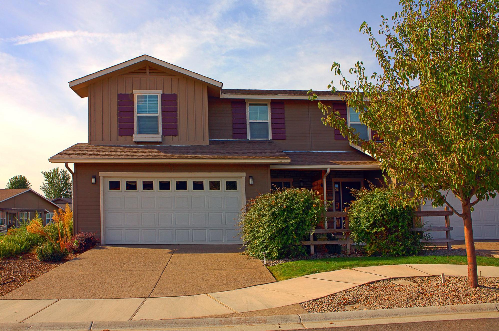
Color is the fastest way to give a home character. A bold shade on the exterior makes people pay attention from across the street. Strong hues show confidence and personality while making houses stand apart instead of blending into rows of sameness. Traditional homes can be lifted instantly with a bold trim or door, while modern builds can wear a full body in a rich shade with clean lines. Choosing bold does not mean strange; it means making the home feel alive.
A home’s exterior is constantly exposed to sunlight and changing temperatures, which test the limits of any paint. To ensure a lasting finish, investing in high-quality, fade-resistant paint is essential. This not only saves you from the expense of frequent repainting but also protects the home’s structure while keeping its color deep and bright for years to come.
What looks vibrant on a tiny paint card can look entirely different outdoors. Colors shift through morning, afternoon, and evening light. Even shadows from trees or neighboring houses can change the way a shade comes across. That is why it makes sense to brush test patches on walls before committing. Trying out a few samples side by side gives the clearest picture of how the final finish will feel over time. It may show that a slightly lighter tone gives the effect you wanted or that a deeper shade works better with the roof material.
Many San Francisco neighborhoods, especially those with Victorian or Edwardian charm, fall under preservation guidelines or HOA restrictions. These rules make sure the original character stays untouched. But that does not mean homeowners cannot bring freshness into the palette. Modern accents, creative trim colors, and subtle shifts can create a classy high-end finish without breaking the rules. It is about respect for history, together with a spark of today’s mood. That balance is what gives an older house a sharp and dignified presence.
For a truly unique exterior, Kanika often recommends high-pigment paints like those from Farrow & Ball, which are known for their exceptional depth and complex tones. These paints deliver a signature soft, chalky finish that appears anything but flat; the color shifts subtly with the changing daylight, giving the home’s exterior a rich dimension and an elevated character that ordinary paints simply cannot match.
Painting decisions feel easier when broken into smaller steps:
| Color Idea | Mood/Effect | Best For House Types | Accent Match Suggestion |
| Deep Navy Blue | Confident, Coastal | Colonial, Modern Coastal | White Trim and Shutters |
| Sage Green with Cream | Calm, Natural | Cottage, Ranch | Warm Stone Pathways |
| Sophisticated Charcoal Gray | Modern, Sleek | Minimalist, Contemporary | Metal Railings |
| Pale Sunshine Yellow | Cheerful, Light | Smaller Suburban Homes | White Window Frames |
| Black with Wooden Tones | Bold, Striking | Modern Clean Architecture | Cedar Panels and Gray Roofs |
Sometimes, painting the whole house in a bright color is not allowed, or simply not what a homeowner wants. Doors and window trims become the best way to express personality. Deep coral or mustard on the front door is enough to turn heads. Lighter trims around windows outline architecture in stylish detail. These touches often transform a quiet exterior into something elegant and charming without overpowering the overall body color.
Where a house is located should influence paint choice. Homes surrounded by trees look natural in olive or moss green. Houses by the ocean often shine in blues, whites, or pale sand shades. For homes in dense urban streets, sharper tones like charcoal or black give a modern edge. Instead of fighting the surroundings, the idea is to work alongside them so the house feels in place yet unique.
Kanika Design has been shaping homes since 2008 with a clear focus on style, detail, and emotion. Founder and Principal Kanika Bakshi Khurana has worked for more than 18 years reimagining rooms and exteriors with unique color palettes and global design influences. The San Francisco Bay Area is filled with homes touched by Kanika’s vision, where function joins beauty. Every project is done with personal storytelling in mind, turning a house into a space where people can feel truly at home.
Some of the best exteriors are not just one thing or another. They mix the cozy feel of timeless design with flashes of modern creativity. A Victorian in beige can feel renewed with teal trims. A minimalist house in gray concrete can come to life with a single wall in orange. These touches breathe energy without losing core harmony. It is this link between old and new that makes a home look stylish for years ahead.
Also Read: 10 Bay Area House Paint Ideas for Stunning Interiors!
Choosing an exterior paint color is one of the most powerful ways to express your home’s character and your personal style. A thoughtful palette, chosen with care, can transform a property and make it feel truly alive. At Kanika Designs, we believe in turning a house into a space that tells your story. If you’re ready to transform your home’s exterior with a modern, sophisticated color palette, contact us for a design consultation.
How do bold exterior colors impact my home’s value?
A well-chosen bold color can significantly enhance curb appeal, making a home stand out and feel memorable, which can positively influence its value. However, it’s crucial to ensure the palette complements the home’s architecture and the surrounding neighborhood, especially in historic areas, to maintain broad appeal.
What kind of paint is most durable for exterior applications?
Using the highest-quality, fade-resistant paint offers the best results for your home’s exterior. Consider brands with a strong history and resistance against extreme weather to get long-lasting durability for your home exterior look.
Why are paint samples so important, really?
A color’s appearance can shift dramatically in the changing light of morning, afternoon, and evening. Shadows from trees or neighboring homes can also alter how a shade looks. Testing large sample patches directly on the exterior walls is the only way to see an accurate representation of how the final color will feel in its actual environment.
How can historical accuracy blend with my taste in painting in a place like San Francisco?
Many of San Francisco’s historic neighborhoods have guidelines to preserve their architectural character. The key is to practice “respectful modernization.” This can be achieved by using creative, modern colors for accents like trim and doors, or by choosing subtle shifts in traditional shades. This approach adds a contemporary feel that reflects your personal taste without compromising the home’s historic integrity.
RECENT COMMENTS