
Art deco interior design has a way of coming back. Every few years it returns to the magazines and the showrooms, gets filed under trend, and then quietly refuses to leave. A hundred years after the 1925 Paris exposition that eventually gave it a name, the geometry and the brass and the jewel-toned velvet are all still here. That persistence is the tell. Art Deco was never a trend at all. It is a vocabulary, a set of moves a room can borrow, and the only real risk in using it today is costuming a house instead of speaking the language with some restraint.
Table of Content |
What is Art Deco interior design?
Art Deco interior design is a design language built on bold geometry, precious materials, and controlled symmetry. Think chevrons and sunbursts, and rich materials like lacquered wood and brass. It took shape at the 1925 Paris exposition and was named decades later. Used with restraint, it brings confident glamour to a room without overwhelming it.
What separates it from most decorating styles is its underlying order. The patterns repeat with intent, the materials are chosen to catch light, and the symmetry holds everything in place. That structure is why a single Deco gesture can carry a whole room, and why the style survives being recombined generation after generation.
Why a hundred-year-old style still feels current
The style crystallized at the Exposition Internationale des Arts Décoratifs et Industriels Modernes, held in Paris in 1925 and visited by something like sixteen million people over its run. Oddly, no one called it Art Deco at the time. The name was shortened from the exposition’s title decades afterward, in the 1960s, once historians went looking for a label.
Yet the work itself was anything but generic. Émile-Jacques Ruhlmann, the cabinetmaker often called the pope of Art Deco, built a pavilion for the exposition, the Hôtel du Collectionneur, furnished in Macassar ebony, ivory inlay, and shagreen. That was the register the style aimed for, precious materials exactly made. The geometry came from the mood of the decade, a machine-age optimism sharpened by the 1922 discovery of Tutankhamun’s tomb. That find sent a wave of Egyptian motifs through the work, the ziggurats and sunbursts and stepped forms that still read as Deco today.
You can still stand inside the proof. The Chrysler Building, finished in New York in 1930 to William Van Alen’s design, wears its stainless-steel crown and its red-granite lobby as pure Deco confidence. Miami Beach holds the largest concentration of the architecture anywhere, hundreds of pastel buildings that locals call Tropical Deco. And each decade kept reaching for the same kit. Hollywood Regency turned its glamour up in the 1930s, and the neo-deco rooms in today’s magazines borrow the same moves again. A look that keeps coming back, generation after generation, is not a passing fashion.
Art Deco and its relatives
It helps to know where Art Deco sits among the styles it is related to, because that is what tells you how to mix it. Art Deco is the source; the others borrow from it or react against it.
| Style | Era | Character | Relationship to Art Deco |
|---|---|---|---|
| Art Deco | 1920s–30s (Paris, 1925) | bold geometry, precious materials, controlled symmetry | The source vocabulary |
| Art Nouveau | 1890s–1910s | flowing, organic, nature-drawn lines | What Deco reacted against, curves giving way to geometry |
| Hollywood Regency | 1930s America | Deco’s glamour turned up, more ornament and drama | Deco’s theatrical American offshoot |
| Mid-Century Modern | 1940s–60s | clean lines, natural wood, little ornament | Keeps Deco’s streamlined silhouette, drops the gilding |
Mixing works best along these family lines. A Deco gesture sits naturally in a mid-century room because they share a love of clean silhouette. Push toward Hollywood Regency and you get more drama and more ornament, which is the right call only if you actually want the volume turned up.
The Art Deco vocabulary
Most of what reads as Art Deco decor comes down to a short, consistent kit. The elements are:
- Geometry. Chevrons, zigzags, sunbursts, and stepped ziggurat forms, pattern with a clear order to it.
- Precious wood and lacquer. Macassar-style ebony, burl veneers, and deep lacquered surfaces with real depth.
- Brass and polished metal. Inlay, frames, and fittings that pick up the light.
- Marble and stone. Bookmatched veining used as a deliberate graphic, not a neutral backdrop.
- Glass, mirror, and jewel-toned velvet. The reflective and the saturated, in measured doses.
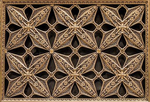
The point is not to use all five at once. A room speaks Deco clearly with two or three of them, as long as the geometry is genuine and the materials are real. That last part matters more than people expect. I can usually tell within a few seconds of walking into a room whether the Deco is real or printed on. A genuine lacquer has a depth you can see into, brass has weight in the hand, and a jewel velvet shifts in the light and only softens as it ages. The costume version, the same motifs stamped onto a builder-grade piece, reads flat almost immediately, and no amount of styling around it covers the difference.
Color in an Art Deco room
Art Deco color runs rich. The palette leans on jewel tones, emerald and sapphire and ruby and amber, the colors of velvet and lacquer and stone. What keeps them from turning loud is the discipline around them. Black, cream, and metallics do the anchoring, holding the saturation in place so it reads as intentional.
The mistake is reaching for every jewel tone at once. A more controlled approach picks one saturated color to carry the room, an emerald sofa, a sapphire lacquered cabinet, a single ruby wall, and lets brass and a quiet neutral handle the rest.
How to use Art Deco now without costuming the house
Here is where most art deco interiors go wrong. They treat Deco as a theme to apply everywhere, and the house ends up reading like a set. The discipline that actually works is restraint through repetition. One geometric gesture, a sunburst mirror, a fluted cabinet, a brass-inlaid console, commands a room precisely because the surfaces around it stay calm. Make the strongest reflective or high-contrast element the accent, never the whole field. The moment every surface asks for attention, the room loses the hierarchy that made the style feel composed in the first place.
That instinct fits the way real homes are built here. A Peninsula remodel or an Eichler with its clean lines can take a single Deco move beautifully, a bookmatched stone fireplace, one lacquered built-in, without surrendering the calm of the rest of the house. It also fits how we think about materials. Brass, lacquer, stone, and velvet are materials that age in rather than wear out, which is the whole idea behind our Earned Beauty principle. Real materials should improve with age, not just look finished on day one.
Kanika’s Perspective
Art Deco gets mistaken for excess, but the rooms that actually work are disciplined. One confident gesture in a real material, a brass-inlaid cabinet, a single wall of bookmatched stone, and you let the rest of the room go quiet. Glamour is a decision you make once in a room, not on every surface.
Kanika Bakshi Khurana
Art Deco gets mistaken for excess, but the rooms that actually work are disciplined. One confident gesture in a real material, a brass-inlaid cabinet, a single wall of bookmatched stone, and you let the rest of the room go quiet. Glamour is a decision you make once in a room, not on every surface.
Bringing Art Deco into a Bay Area home
The genuine version of this style is, in practice, a sourcing problem. The real lacquer, the brass with weight, the bookmatched stone, and the jewel velvet that ages well are not the things sitting on a showroom floor, and finding them is a good part of the work. It is also why the single gesture matters more when it is specified and built into the room as part of one material scheme, rather than bought as a standalone piece and set down to fend for itself. That is the way a full-service studio like Kanika Design tends to work, sourcing the material and detailing it so the one Deco move reads as deliberate.
If you are weighing Art Deco for a home in Palo Alto, Atherton, or elsewhere on the Bay Area Peninsula, the question worth asking is not how much of it to use, but which single gesture earns the room. Talk to our team about a full-service interior design project and we can help you find it.
FAQ
Q. What are the key elements of Art Deco interior design?
Bold geometry (chevrons, sunbursts, stepped forms), precious materials like lacquer and Macassar-style wood, brass and polished metal, marble with strong veining, and jewel-toned velvet, all held together by symmetry and used with restraint.
Q. What colors are used in Art Deco design?
Jewel tones lead the palette. Emerald and sapphire are the most common, with ruby and amber close behind, set against black and cream and warm metallics such as brass and gold. The strongest rooms commit to one saturated color and let the neutrals and metals carry the rest.
Q. How do I add Art Deco to a modern home without it looking like a theme?
Use one confident gesture and keep the surfaces around it calm. A sunburst mirror, a fluted cabinet, or a bookmatched stone surface reads as Deco without turning the house into a set. Restraint is what separates glamour from costume.
Q. Is Art Deco still in style?
Yes. A century after the 1925 Paris exposition, Art Deco keeps returning because it is a design vocabulary rather than a passing look, recombined by each generation from Hollywood Regency to today’s neo-deco rooms.
Q. Can I mix Art Deco with other design styles?
It mixes well along its family lines. It pairs easily with Mid-Century Modern, which shares its clean silhouette, and with Hollywood Regency, its more dramatic American cousin. The cleaner the surrounding style, the more a single Deco gesture stands out.
RECENT COMMENTS